This documentation also exists as a pdf version or a docx version.
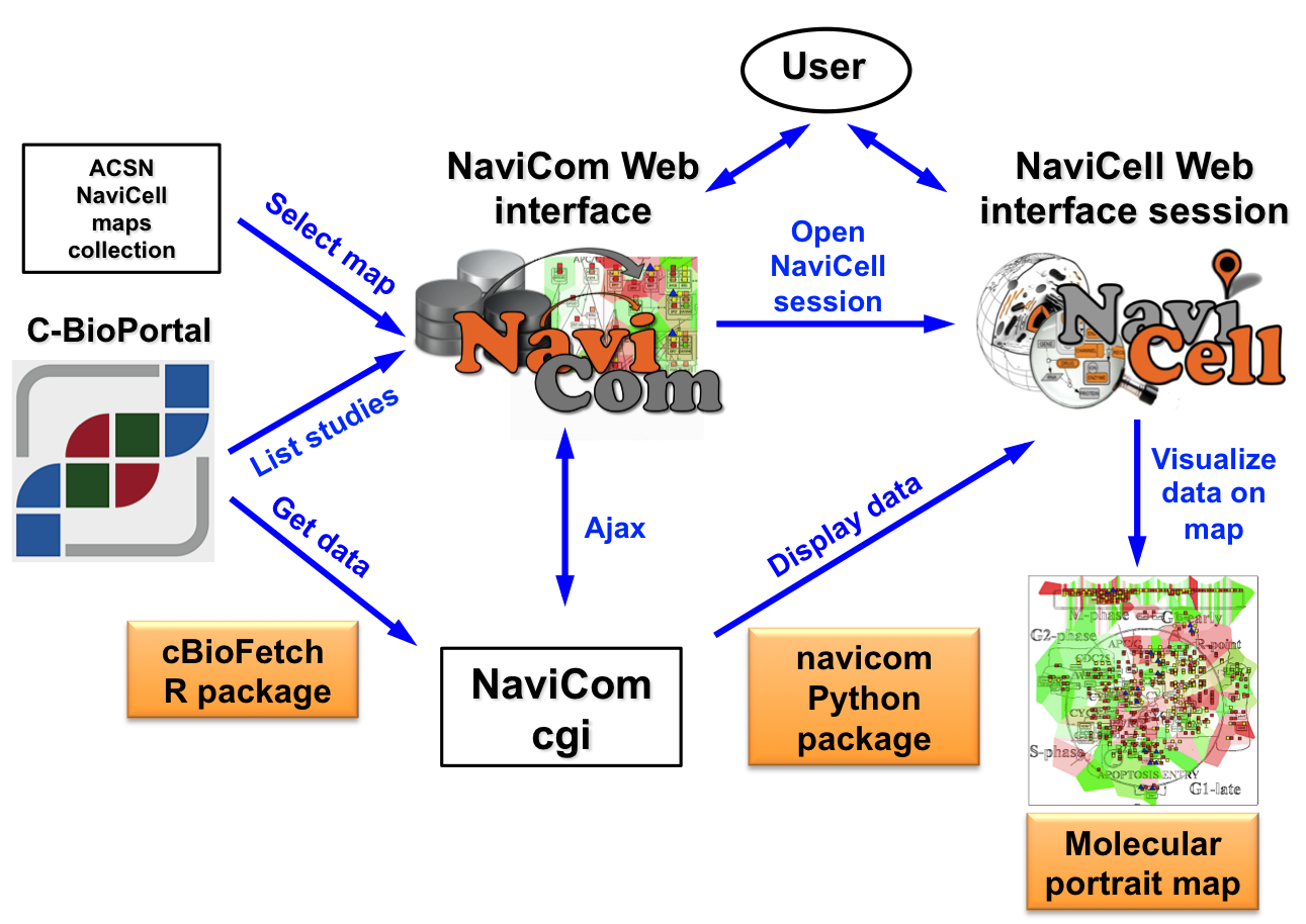
NaviCom connects between cBioPortal and NaviCell and allows to visualize various high-throughput data types simultaneously on a network maps in one click.
NaviCom is empowered by the cBioFetchR R package to retrieve data from cBioPortal and the python module navicom to display those data on NaviCell signalling network maps. The interactive maps with displayed data can be browsed and analyzed in NaviCell environment.
The studies available in the cBioPortal database contain large-scale cancer data sets including expression data for mRNA, microRNA, proteins expression; mutation, gene copy number and methylation profiles and beyind.
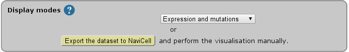
Depending on the nature of data, different types of visualisation modes can be required to achieve the informative picture. NaviCom provides a default visualisation setting for simultaneous integration of the data into the big comprehensive maps of molecular interactions to visualize a complex molecular portrait. Once chosen, these settings are applied automatically, significantly reducing the time required to perform the visualisation comparing to manual mode. It also allows launching the visualisation of several datasets on different maps in parallel.
The resulting maps with visualized data on top of them are interactive, they can be browsed using NaviCell Google-based navigation features that allow to visualize the data at different zoom levels, starting from the top level view, were patterns of integrated data can be grasped, up to the most detailed view at the level of individual molecules. In addition, since the whole dataset is already imported to NaviCell in a form of data tables, the user also may apply different types of analyses provided by NaviCell environment.
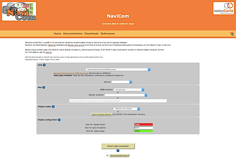
NaviCom platform is accessible via the home page that provides interactive selection panel to define study dataset, map and data display mode, to execute the visualisation and full downloadable documentation on the tool.
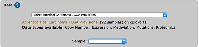
The list of studies is obtained through the cBioPortal API, and thus contains all studies available from cBioPortal at the moment. Once the study is selected, a short summary including types of data and number of samples available, is provided.
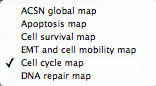
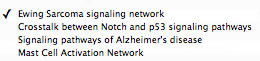
Select a map from the set of curated maps of the Atlas of Cancer Signaling Network collection, from the NaviCell collection, or provide an URL to another NaviCell map. The user can import and visualize data via NaviCom on any type of signaling networks.
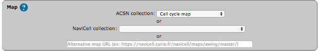
| ACSN maps collection | NaviCell maps collection |
|
|
|
|
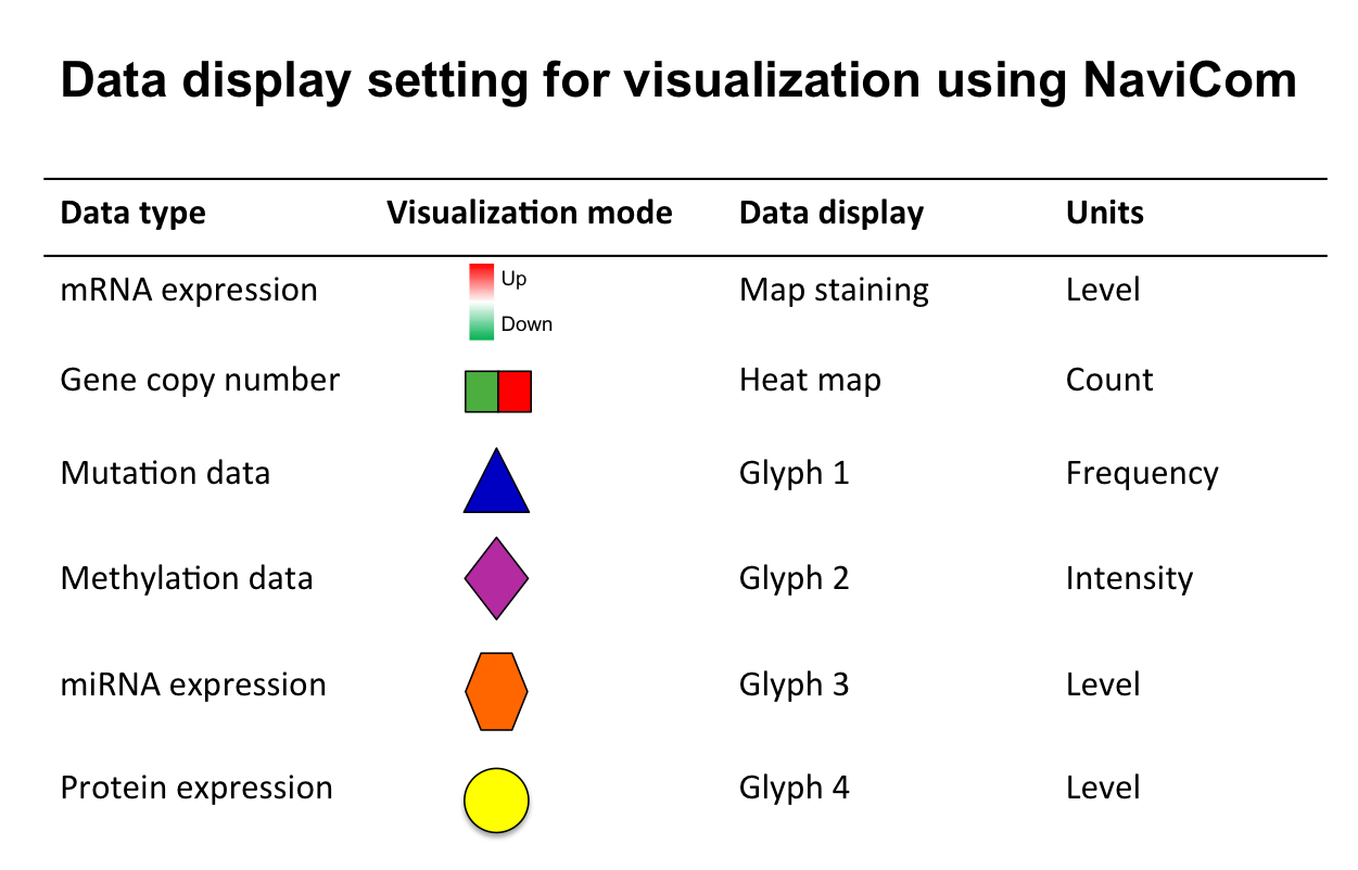
In NaviCell data can be graphically represented in a form of barplots, heat maps, glyphs or projected as a map staining, unique display mode coloring background areas around each entity according to the value of data value associated to this entity (Bonnet et al., 2015). NaviCom uses this graphics to overlay multiple data types. The settings are standardized and data display modes are pre-defined in NaviCom, projecting high-throughput data on NaviCell maps in automatized manner. Optimized visualization mode is chosen for each data type to achieve meaningful integrated view on complex molecular profile in the context of signalling network map.
Click ![]() icon on the upper panel of NaviCom homepage to open the display setting legend
icon on the upper panel of NaviCom homepage to open the display setting legend
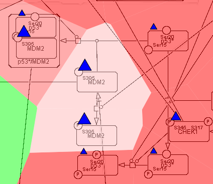
Map staining:
The principle of map staining is in using the background of the map for visualizing the values mapped to individual molecular entities or group of entities (modules). The resulting colorful background of the network map, provides a possibility to grasp differences in the patterns of data distribution between samples or between groups of samples. To define a territory in the background occupied by a single molecular entity, the whole map territory is divided accordingly to the Voronoi cells computed from the positions of the nodes in the map. The sizes of the Voronoi cells are limited in order to avoid very large cells in the regions of the map empty from proteins or genes. Each Voronoi cell is then colored with semi-transparent color corresponding to the value mapped to the biological entity located in the center of the cell.
Heat map:
The data is displayed as color squares. Each square represents a sample in the data table, whereas the color corresponds to the individual values represented in the data table.
Glyph:
Glyph has three characteristics: shape, color and size, each one of those characteristics can be configured according to a different feature in the data. In NaviCom, the shape and the colour are associated with the data type and the size reflect the value in the data table.
NaviCom display modes:
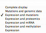
| Complete display | all data available for a given dataset |
| Mutations and genomic data | expression-map staining / copy number-heat map / mutations-glyph 1 |
| Expression and copy number | expression-maps staining / copy number-heat map |
| Expression and mutations | expression-maps staining / mutations-glyph 1 |
| Expression and methylation | expression-maps staining / methylation-glyph 2 |
| Expression and miRNA | expression-maps staining / miRNA-glyph 3 |
| Expression and proteomics | expression-maps staining / proteome-glyph 4 |
| Expression | expression-map staining |
Select data display mode according to the data available in the chosen dataset and the scientific question to answer.
| Display modes |
 |
These pre-defined settings are flexible; after the data integration into the maps, the user can continue adjusting the visualization modes according to the scientific question.
The NaviCom platform provides the possibility to export the dataset from cBioPortal directly to NaviCell in order to perform some custom visualisations.
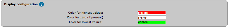
The color gradient for map staining and heatmaps can be adjusted. For colour adjustment, use the color selector or directly type a color hexadecimal code
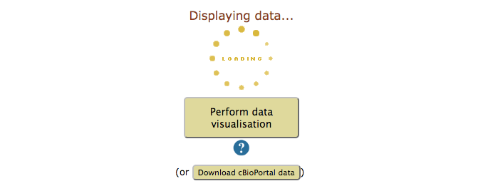
After validation of the visualisation, a loading symbol will appear on the NaviCom page, which will terminate once the cBioPortal data have been downloaded by the navicom server.
Invalid map: update HUGO names of entities on the map
map entities are not annotated correctly, NaviCom cannot recover the HUGO names.
Not a NaviCell map: update the url or update the correct map
the URL or the map is not correct.
Gateway TimeOut: wait a few minutes and try again
the requested data were not cached yet, and were too big to be downloaded in less than 5 minutes.